Planning on taking a fresh dip in a public pool this summer but scared of claims like “the average swimming pool in the US contains 6.23 fecal accidents”?
I don’t blame you. That sounds gross. But what might be of some comfort is a better understanding of “averages” — and why that means some pools could actually have no poop at all. (And yes, others could have a lot.)
In this month’s newsletter we’re digging into two common statistical terms that pop up in headlines, “average” and “median.” Here are a few not-so-average data journalism projects to help us understand what these terms really mean.
1. “Stools in Pools” by Mona Chalabi, Data Editor at Guardian US.
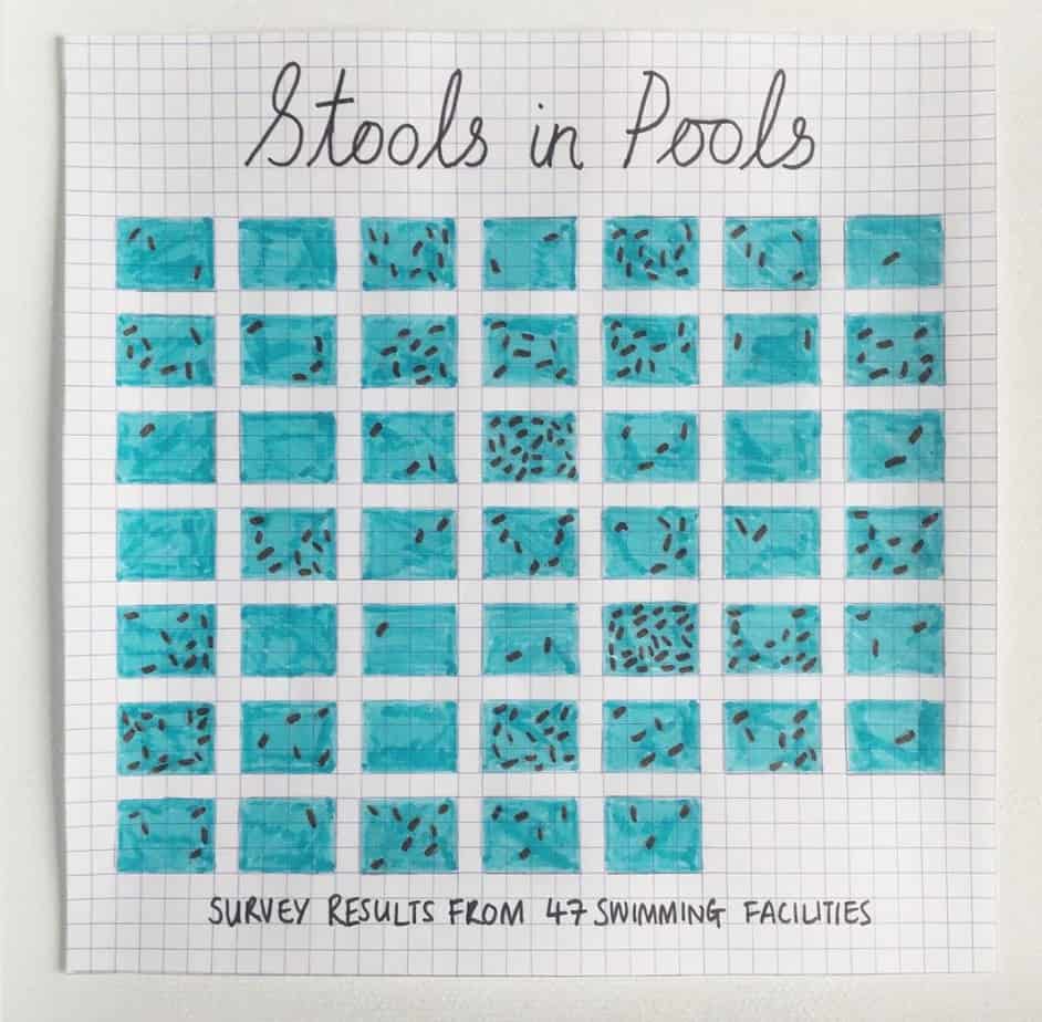
Let’s start with the stools in pools. Data editor Mona Chalabi looked at the original data and found the 6.23 poops per pool came from the U.S. Centers for Disease Control and Prevention, which conducted a survey of 47 swimming pools, counted 293 turds total, divided by the number of pools surveyed and found an average of 6.23 “fecal accidents” per pool.
But, rather than conclude that there were actually six and a bit poops per pool (eww!), Chalabi spent an evening randomly redistributing the poop to make a point. If you look at the image she created (above) you’ll see that according to her random scat splatter, some pools could have no poop and others could have a lot.
“You can kind of see how misleading averages can be,” she explains in this awesome TED talk. An average may reflect a general picture of the state of the scat, but it won’t necessarily reflect the reality of individual circumstances — and can therefore falsely portray a poopless pool as a cesspool. Check out more of Chalabi’s amazing artwork here.
2. Google News Labs’ data visualization project brings together designers from all over the world to turn raw data into visuals that tell stories. The portfolio of growing projects is updated here.
One of the visualizations that really stuck with me came out of the Google News collaboration and is called “How to fix a toilet, and other things we couldn’t do without search.” The visual essay, which depicts people’s most common online home-repair searches around the world, “aims to highlight how much we depend on search to know ‘how to do’ everyday things,” writes author Xaquín González Veira.
If you input a country, the size of each household item or appliance depicted will change based on the number of searches people in that country made to find out how to fix it. The pink line shows the world median. (In this case, it seems Canadians have a better handle on how to repair their toilets than others around the world, or they might just have the money to hire a plumber.)

This is a good place to point out that the “median” is different than the “average.”
Both of these numbers are meant to give you a good overall picture.
Average takes all the numbers in a series, adds them up and then divides that number by how many numbers are in the series. (Like this: 2, 4, 6, 8, 10. Together they add up to 30. Divide that by five and you get an average of 6.)
Median just takes the middle number in a sequential series. (Like this: 2,4,6,8,10)
The average (also known as the “mean”) works best when most of the numbers are not too far apart from each other. But the median is useful when extreme outliers can skew the average. For example, imagine you wanted to build affordable housing for the fictional city of Statistica. The population of seven each make different annual incomes, ranging from $15,000 to $100,000.
Here they are in these recent headshots:

The average income would be around $51,700. But in reality, most people make much less than that and the average would be skewed higher as a result of our big earner number seven.
The median would take the middle number, in this case $40,000, and provide a better reference point to get an idea of what most people might be able to afford.
Housing prices are another example of where the median is a better indicator than the average, particularly if you live in a city where homes can range in price from the thousands to the millions.
3. “Plastic Cups” by Chris Jordan
Now that we’ve got a better grasp on average versus median, I’d like to leave you this month with one more cool visualization: a more tangible taste of unrelatable numbers.
At first glance the image below might look like a computer chip or an abstract image of an industrial factory. But it’s actually “one million plastic cups, which is the number of plastic cups that are used on airline flights in the United States every six hours,” photographer Chris Jordan explains in this TED talk.

When we hear numbers like millions, billions or trillions, they can be hard to comprehend.
What Jordan hopes to accomplish through his art is to take statistics and “translate them into a more universal visual language, that can be felt.” His belief, he says, is that “if we can feel these issues, if we can feel these things more deeply, then they’ll matter to us more than they do now.” His project “Running the Numbers” (best viewed on a desktop) is available here.
What we’re wrangling right now
I tried my hand at a Mona Chalabi-inspired graph in honour of Canada Day. Here’s the popularity of the Google search for “firework” over a year in Canada.

“Fireworks” was very similar. (Fun fact: each province was very, very different, but Canada as a country seemed to have one clear trend.)
Know your sources
- 2017 Xaquín González Veira, Medium “Some notes on a collaboration with a Google news lab”
- 2016, Michigan State University, “Mean vs. median: What do they mean and when do you use them?”
- 2018, Google trends data for “firework”[end]
What did you think of this story?
Your feedback after we publish a story helps ensure we're always improving our reporting to better serve you